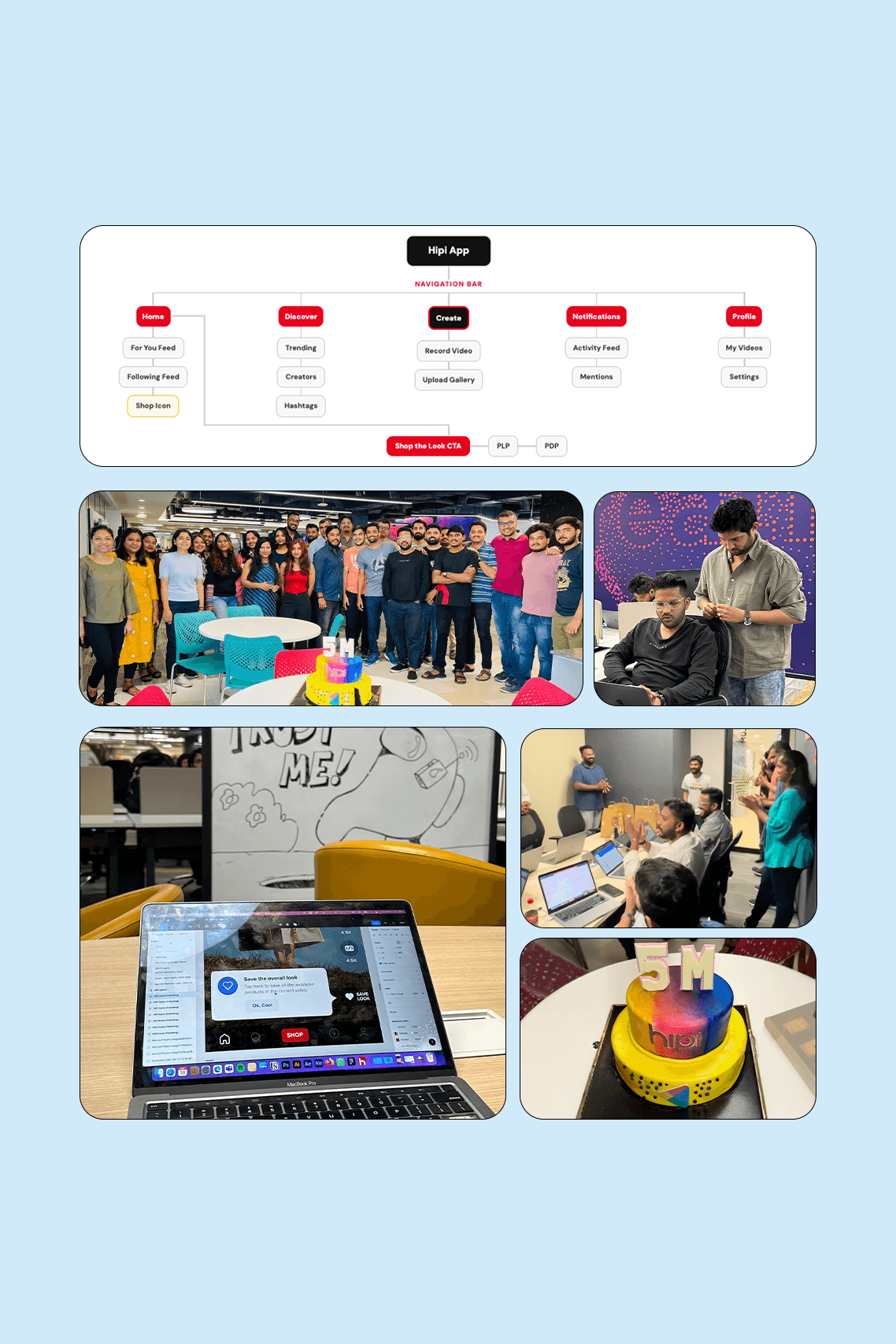
Home & Navigation IA Transformation
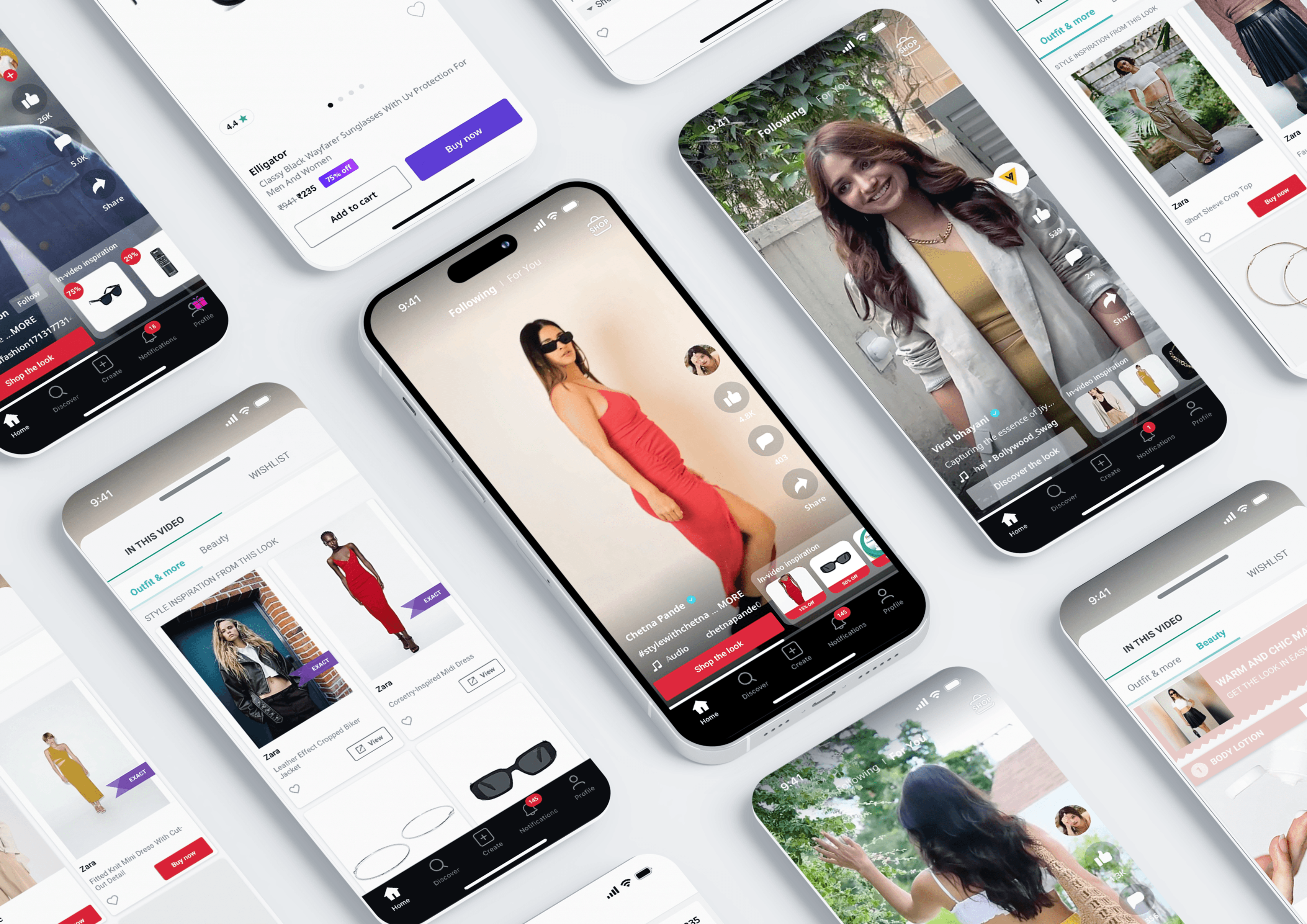
Hipi is a short-video UGC platform by Z5 serving young Indian users across Tier 1-3 cities. Although shoppable products were embedded within videos, commerce traction remained low due to fragmented entry points and an unclear navigation hierarchy. This redesign streamlined the Home screen and NavBar, shifting commerce from a navigation-driven model to contextual discovery within the video experience. The introduction and optimization of a prominent “Shop the Look” CTA played a critical role in driving intent, making product discovery explicit, actionable, and seamlessly integrated into the viewing flow, reducing confusion and strengthening shop behavior without disrupting entertainment consumption.
1-2 Months
Product Design + Strategy
Product Manager
Engineering
Business
Marketing
Responsibilities
UX Audit
Research Synthesis
Navigation Redesign
Usability Validation
The Problem
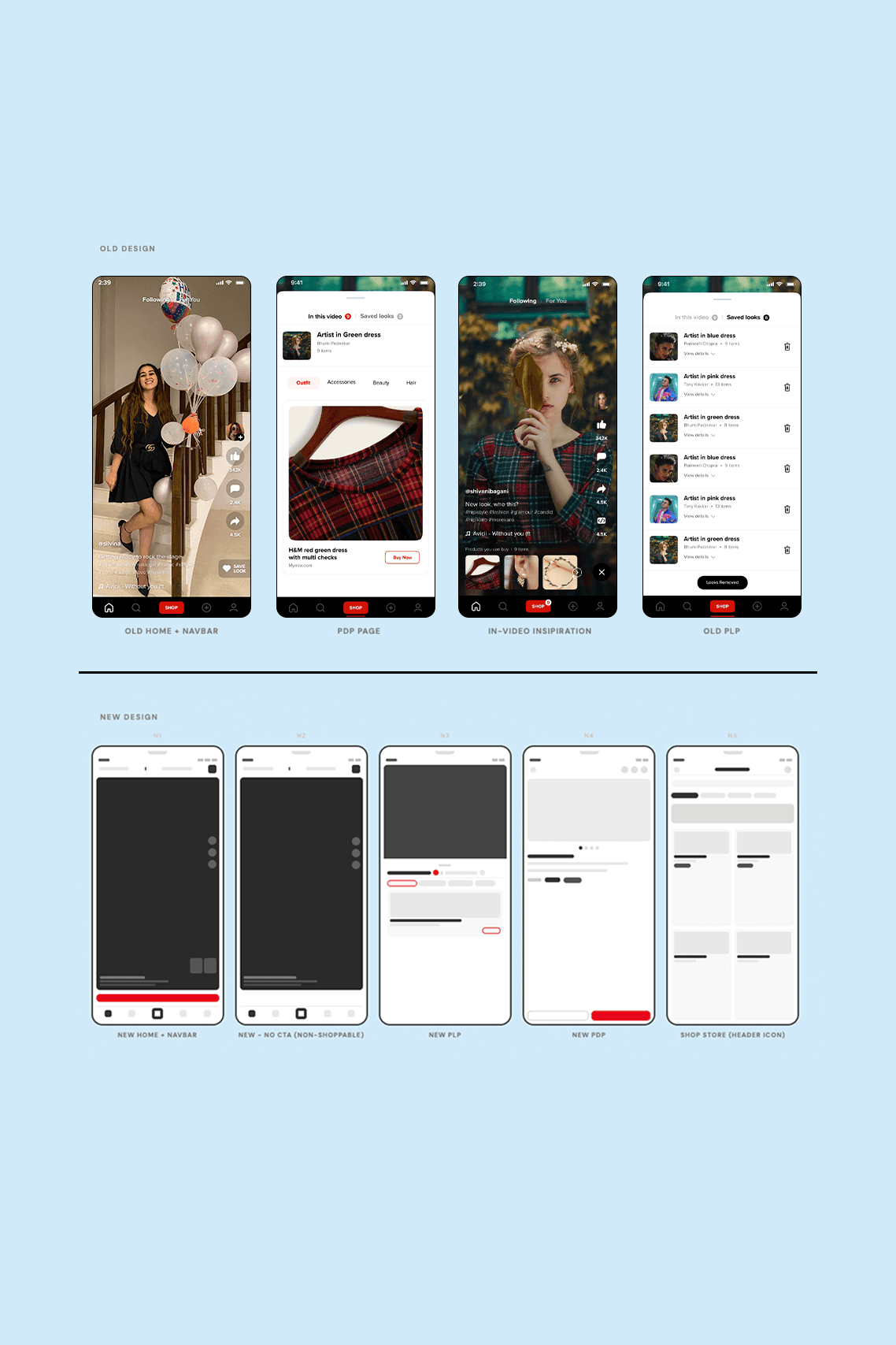
Commerce entry points were fragmented and misaligned with user behavior, resulting in low Shop activation and frequent funnel drop-offs. The NavBar Shop button underperformed, multiple CTAs created decision paralysis, and non-shoppable videos left users interacting with broken states.
The Goal
To redesign the navigation and Home experience so that commerce felt contextual, intuitive, and aligned with user intent increasing shop engagement while restoring Create as the primary central action.
5M+
Play Store Downloads
+ 28%
Shop Funnel Completion
+33%
Creator Activation Boost
UX Process
Research & Analysis:
Research began with a full UX audit of the existing Home screen and commerce flow, mapping every touchpoint where users could enter the shop funnel. The objective was to diagnose why Shop engagement lagged despite visible commerce integration.
Heatmaps showed the NavBar Shop button had the lowest tap rate among all navigation items.
Three overlapping shop entry points created decision paralysis users hesitated or avoided tapping entirely.
Non-shoppable videos left the Shop button appearing broken, eroding trust and perceived system reliability.
The Create button’s position violated mobile conventions, reducing creator action visibility.
User interviews confirmed that most participants treated the NavBar Shop, Save Look, and in-video thumbnails as duplicate actions rather than distinct pathways. Competitive benchmarking (TikTok Shop, Instagram Shopping, Meesho) reinforced that contextual CTAs embedded within content outperform navigation-level commerce in discovery-mode environments.
The core hypothesis emerged clearly: commerce should live inside content context, not inside primary navigation.
Pain Points:
Too many shop CTAs with no visual hierarchy led to confusion and inaction.
Shop button appeared broken on non-shoppable videos, reducing feature trust.
Create action was deprioritized in NavBar, conflicting with user expectations.
PLP did not preserve browsing context, causing session drop-off when navigating back from PDP.
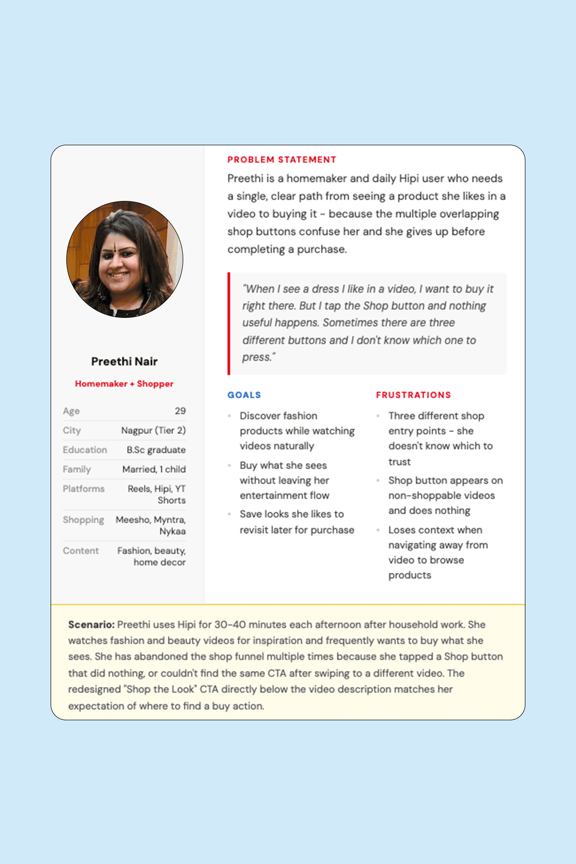
User Personas Summary:
Participants (aged 16-36) spanned Tier 1 (Mumbai, Delhi, Bangalore), Tier 2 (Jaipur, Nagpur, Coimbatore), and Tier 3 (Meerut, Bhilai, Vizianagaram). The majority were women aged 18-32; including homemakers seeking fashion inspiration and young working professionals shopping reactively. A smaller male segment consumed sports and comedy content. All participants used Meesho, Myntra, Flipkart, Amazon, or Nykaa for shopping and Instagram Reels or YouTube Shorts for video consumption. None intentionally used the NavBar Shop button; all discovered products reactively through in-video thumbnails.
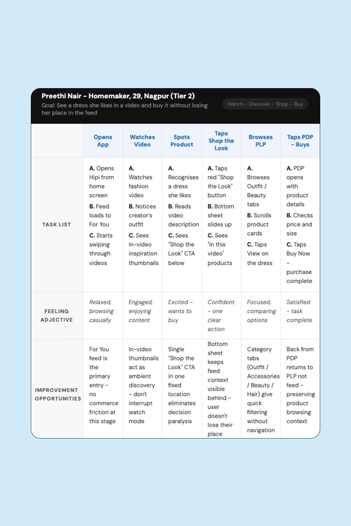
User Journey Summary:
Users entered Hipi in passive entertainment mode, scrolling through the For You feed without explicit shopping intent. Commerce activation occurred reactively when a product caught attention within a video. At that moment, users tapped contextual CTAs (thumbnails or Shop the Look), never the NavBar. After entering the PLP, users explored products but often dropped off when returning from PDP because browsing context was lost.
Key insight: commerce must be triggered inside the content moment, not forced through navigation.
IA, Behind the Build & Wireframes
Product Experience Walkthrough
Usability Analysis & Product Impact
Usability Analysis:
Two rounds of moderated testing were conducted (R1: 8 users, R2: 7 users) to validate the Home and shop funnel redesign. In Round 1, 6/8 users tapped the old NavBar Shop on non-shoppable videos and interpreted it as a bug, while 5/8 hesitated when presented with three competing CTAs, confirming decision paralysis. 7/8 instinctively tapped the center position expecting Create, validating its repositioning and the removal of Shop from the NavBar.
Round 2 achieved 100% task completion for the new “Shop the Look” flow, with an average 1.8 seconds to first tap. Minor refinements included improving header store visibility and preserving PLP tab state on back navigation.
Product Impact:
The redesign shifted commerce from navigation-based discovery to contextual activation, reducing friction while restoring Create as the primary action. Shop funnel completion improved, creator interactions increased, and trust strengthened through conditional commerce visibility.
Aligned with Business and Marketing, the post-launch benchmark of 5M+ Play Store downloads was successfully achieved, validating both product clarity and market positioning.